NEW Brochure Holders from Stack Displays! 0

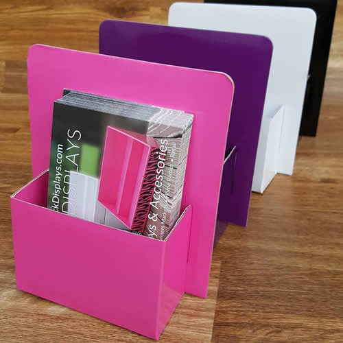
New for 2016! Brochure holders that match our Stack Displays! Sold in a 2 PACK!
Now you can easily display all of your postcards, blitz cards or brochures on your vendor table in our new matching BROCHURE HOLDERS! Lightweight, yet very sturdy and easy to transport to your events! You can also use these at home on your desk to keep your literature organized!
The inside dimensions are 4 3/4" wide x 2" deep. Overall dimensions are 6 1/2" wide x 7" high.
Our new brochure holders were designed to be a little bigger than ordinary brochure holders to accomodate different size postcards, as well as over-sized brochures, which makes our holders more versatile. They were also designed to sit deeper, so that if used at an outdoor event, they are less likely to blow over. Use in your home office to keep your brochures or postcards organized!
Made with the same materials as our Stack Displays with our signature laminated finish, you will love how lightweight, yet sturdy these brochure holders are!
CLICK HERE TO ORDER BROCHURE HOLDERS!

- Stack Displays
- Tags: black brochure holders business card holder literature holders pink purple stack displays white
Using PINK in Your Product Displays and Vendor Booth 0


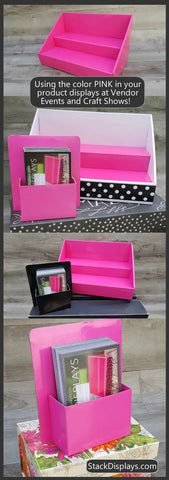
If the color PINK is your main product or branding color, here are some tips on how to use it more effectively when setting up a product display or vendor booth!
CLICK HERE TO SHOP AT STACK DISPLAYS
WHAT DOES THE COLOR PINK MEAN?
Most of us know that pink is represented with feelings of love, nurturing or compassion. Some shades of pink give off a feeling of romance or intimacy, while other bolder shades can make you feel more on the "passionate" side! If your main color is PINK, then it is probably safe to say that the majority of your potential customers are women. Most women are comfortable with the color pink. It is calming and puts people in a more nurturing or calm state of mind.
USING PINK IN YOUR PRODUCT DISPLAY OR VENDOR TABLE
Visually, PINK is usually appealing to women, however, it is possible to utilize TOO MUCH pink in your display or on a single vendor table. If your space is small, or you are just utilizing one or two tables to set up, don't over-do it with too much pink. If your products are PINK or have a lot of PINK in the packaging, make them stand out by using a contrasting color like a black table covering or by using a black product display to set them on. I'm a big fan of using a black backround for many types of displays, as it makes it easier to give your products and what you are selling "center stage". However, if your products themselves are black or have very dark colors in their packaging, then you may want to use a lighter contrasting color to set them on.
Be careful of using different shades of PINK that DO NOT match! It is ok to use different shades of the SAME COLOR. Think of how ombré colors looks, or a color swatch that you get from the paint store. They are different shades of the same color and it is very pleasing to the eye.
PINK ISN'T FOR EVERYONE
Not all women like a "girly" feel to things and using the wrong shades of pink or too much pink can make your display look like it is geared to a YOUNGER female demographic. So unless your potential customers are little girls, tweens or teens, be careful of the shades of pink you use and HOW MUCH PINK you use! Again, unless you are appealing to little girls, less is more when using pink!
USING PINK IN YOUR VENDOR BOOTH
A PINK vendor booth will definitely stand out in the crowd. Many people today are utilizing different color pop up tents, not only to match the color of their branding, but more importantly, to make their booth stand out! When you are setting up among many vendors, each using a tent, a pink booth or pop-up tent will definitely catch the eyes of your potential female customers! They will also be able to easily locate you in a crowd of many vendors. If you can, make sure to buy a pink tent that is the right shade of pink and matches the colors you are using in your display! Things like this may not seem very important, but I have had people visit my own booth in the past, simply because they recognized the color of my tent and the way I visually set it up. I used to also utilize curtains around my tent to give it a more refined, beautiful feel. So, if you do multiple events, don't discount what the outside of your booth looks like, as well as the inside!
GIVE YOUR PINK DISPLAY OR VENDOR BOOTH A MORE MATURE LOOK
If you are setting up a booth utilizing a lot of pink, you can add some items that can give the color pink a more mature, classy feel to it. Some of the most beautiful display booths I have seen have had a faux chandelier hanging from the middle of the tent! Adding some acrylic or solid black displays can also give your entire display a more sophisticated look.
THE BOTTOM LINE
PINK is a beautiful color, but be mindful to how you use it, what SHADES you use and how MUCH of it you use! As I always suggest, stand back from your display when you set it up and look at it from the point of view of the customer walking by.
We always love seeing how people set up their displays or vendor booths, so feel free to send us pics and show us how you do it! We might just feature you on our Facebook Page, Instagram, or Pinterest account! Comment below and give us YOUR thoughts on using the color PINK!
CLICK HERE TO SHOP AT STACK DISPLAYS

- Stack Displays
- Tags: craft show pink setting up your display booth vendor booth vendor display vendor show vendor table

